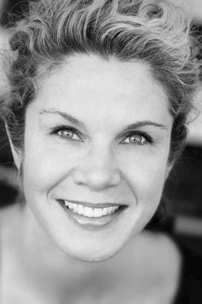
This is the portrait I shot of my dear sister-in-law, Mary, for her LinkedIn page and her new job. So far so good.
My sister-in-law Mary needed a new headshot for her LinkedIn account. She got a new job so she wanted a new photo; it’s simple. We were at a family event, she was all dolled up, I found a beautiful space with some beautiful light and I photographed beautiful Mary in it. Done. Sort of.
I was rather proud of myself. It looked great! I sent her the photograph and she responded with a XOXOXOXOX email. So now I’m a big hero. (Shooting a nice photograph of Mary, by the way, is like shooting ducks in a pond. She’s really good-looking and she knows how to turn it on for the camera. Everyone who’s shooting a picture of his sister-in-law for LinkedIn should be so lucky.)
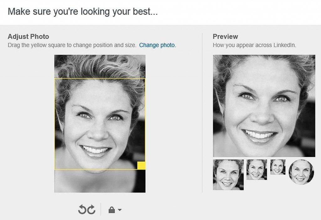
Then a couple of days later she sent me another email. There’s a problem. No XOXOXOXOXs attached this time. This graphic was attached:
And this is the stylesheet supplied by LinkedIn to demonstrate what the crops will look like in the various uses on their page. I completely ignored it. Almost any site on the Internet that uses your picture as an avatar has a demonstration page that looks like this.
In order for her to use her picture on LinkedIn she has to crop into it and the crop isn’t working too well. (They have certain parameters at LinkedIn and I had ignored them.) She had to crop too much of the top of her head and crop into her chin. This was all embarrassing for me because I knew exactly how to shoot a LinkedIn headshot and on that particular occasion I failed.
Very simply, I didn’t leave room around Mary’s head for the square avatar headshot crop of the early 21st-century.
Head shots on LinkedIn are square. I shot a beautiful, extremely tight vertical. There was no option for a nice square crop. Whoops.
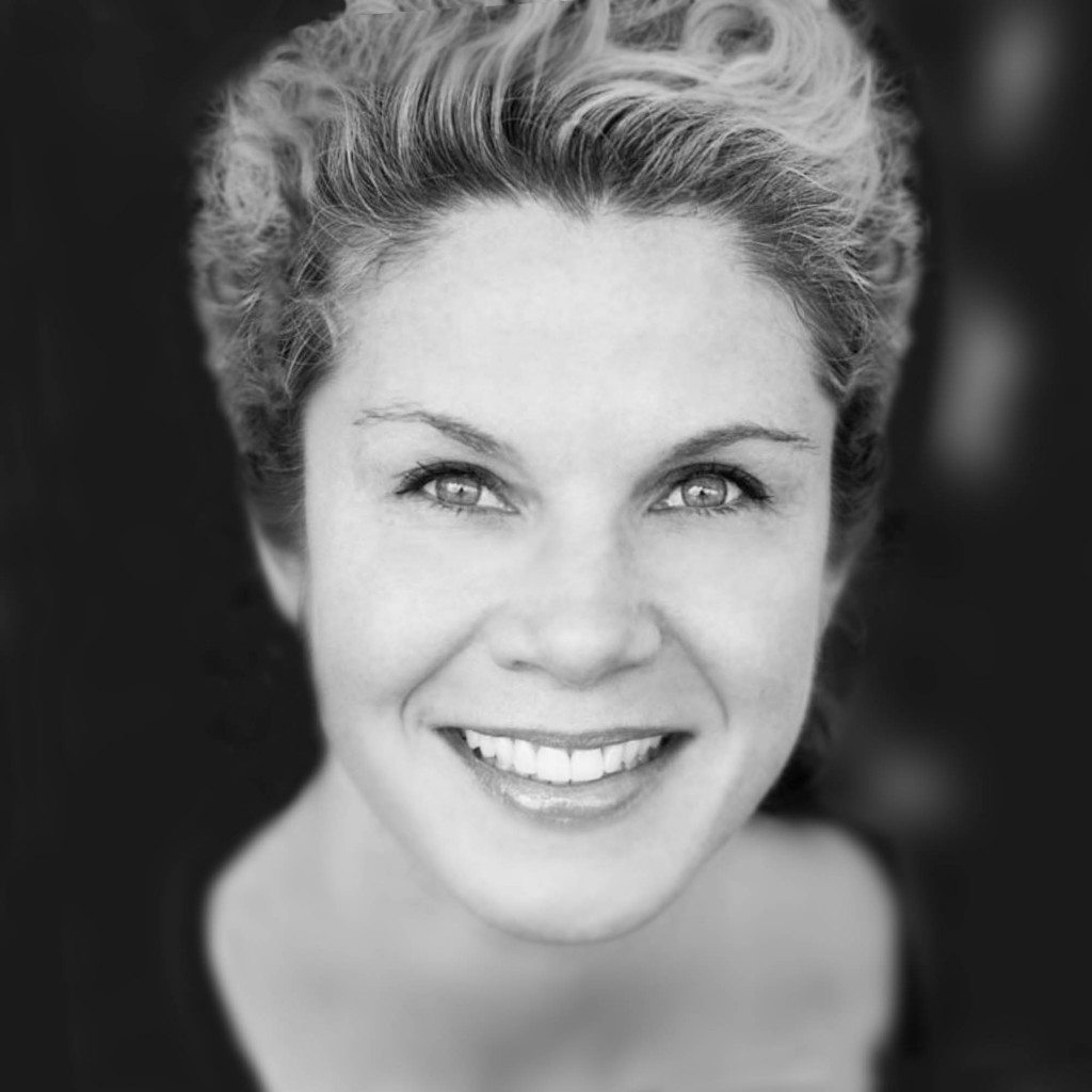
So then, with my neck strap between my legs, I went to Photoshop and tried to add space to both sides of the picture so that she can crop it into a square. Now I’m actually rebuilding Mary’s head/hairstyle and doing a really lousy job of it. (I’m totally unqualified to rebuild anyone’s hair.) But I did the best I could. In my heart, I knew it really didn’t look like Mary anymore but I was trying to pretend that it did. So I emailed her this new version of the photograph:
This is my Photoshop reconstruction of Mary’s hair and addition of some black space to the sides of the picture that would allow for a square crop. If you know Mary, you know something’s a little off here. She would never wear her hair like this. ( She actually looks like that attractive woman from my mother’s 1960s bridge club.) I did convince myself, however, that it looked pretty good and I sent it to her. The word delusional comes to mind. Now that I look at it, I’m getting a little bit of a Bride of Frankenstein vibe here. Sorry, Mary.
She responds with a “You’re the Best, XOXOXOXOX” email. Actually, Mary’s the best but I’m sensing that this was a less than heartfelt XOXOXOXOX. I know she knows this picture doesn’t cut it; I know she knows I totally blew it when I shot the photograph. I just didn’t leave space around her head. Rookie mistake! I completely spaced out and did not shoot the appropriate photograph for its intended use and I really pride myself on being good at that.
This one stung a little bit, and the only reason I’m even sharing it with you now is to maybe make the world a happier place and have fewer photographers out there shooting uncroppable photographs for their sisters-in-law.
So leave some cropping room around the head when you shoot a professional portrait for somebody. It’s important these days—many of them end up as squares. Squares can make for tricky crops; that’s a lesson many photographers need to learn. Just leave a little margin for error. Put some breathing room in those pictures. And while I am at it we may as well review some simple tips for shooting business headshots.
- You want flattering light. Very often, you can find that light in a entryway into a house while there is sunlight bouncing off the sidewalk outside. Have them stand in the doorway looking outside. You stand outside and look in. That’s called beauty light. It’s soft – the shadows are not harsh – and it makes everyone look good.
- You can’t go too far wrong with a really simple background. It could be a plain white background or a plain black background or just gray. Or it just could be out of focus mush back there that gives the feeling that the person is in front of some kind of environment. It doesn’t really matter what the environment is, it just gives the feeling that the person is someplace busy and important.
- Simple solid colored clothing is always a good idea.
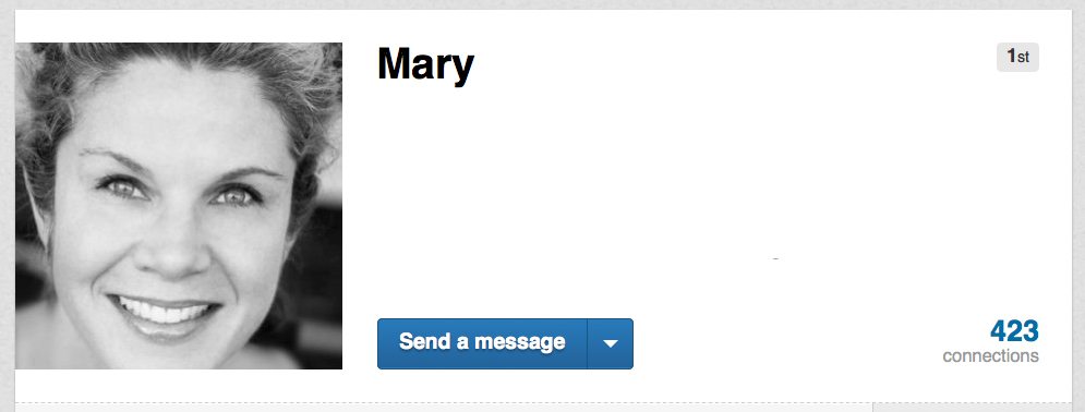
- Making sure your subject isn’t shiny is always a good idea, too. I often have headshot subjects wipe their face with a kleenex or make a trip to the ladies room or men’s room just to wash their face or do whatever it is people do before they want to look good. I tell them I make all my photo subjects do this even if that’s a lie. It may be a lie but it’s a good general policy.Anyway, I just went to Mary’s LinkedIn page to see what head shot she’s using and she’s using the picture that looks like her but with the bad crop. Looks like we’re going to reshoot at the next family event.
This is Mary’s headshot as it now appears on her LinkedIn page—too much cropped off the top, too much cropped off the bottom.

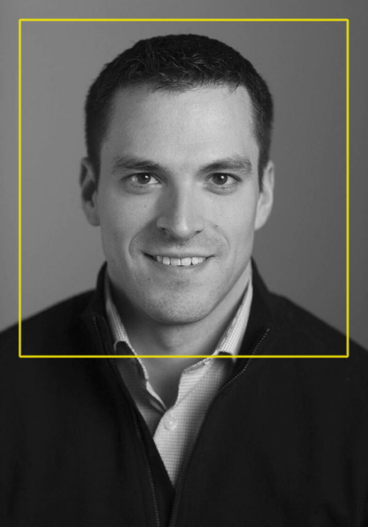



She’s beautiful! The crop doesn’t bother me. Her “person” shines through.