If you casually let the horizon line in a photograph land where it may, you’ve put yourself at the mercy of one of the boldest graphic elements that will ever appear in your pictures. And it appears so often in photographs, you need to be in charge of it and use it to your benefit.
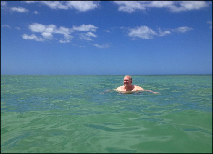
What a wonderful job I did above of demonstrating two fatal horizon-line mistakes in one picture. The horizon is running exactly through the middle of the picture and it’s landed right on my father-in-law
It’s generally considered that the worst place you could put the horizon would be smack dab in the middle of the frame—exactly between the top and bottom of the frame. It feels like somebody simply couldn’t make up their mind about where it should be, and so they tried to make everyone happy; the sad result being that nobody is happy.
If you follow the rule book—the rule-of-thirds book—you put the horizon one-third up from the bottom or one-third down from the top. This does feel like somebody put it there intentionally, so everyone can relax. You can’t go too far wrong with this. If you’re a horizon-in-the-middle-of-the-frame person, it’s time to branch out—or at least up or down— to the rule-of-thirds.
But when photo subjects, specifically people, enter the picture, there’s a whole new set of considerations. Is the horizon line above or below their head? If it’s above their head, there’s often a feeling that you’re looking down on a person, and if it’s below their head, there’s a bit of a we’re looking-up-at-them feeling.
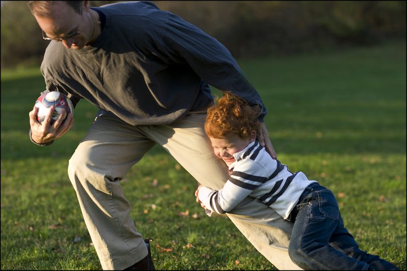
Placing the horizon line between these two players makes the dad feel bigger and the little boy feel smaller, accentuating the discrepancy between their sizes.
And then sometimes you need to place the horizon line so it doesn’t interfere with the subject. It needs to be tucked away so it doesn’t result in some kind of unfortunate alignment. You probably wouldn’t want the horizon sitting right on top of somebody’s head, for example, or a raised hand landing right on the line. Tall photographers are at an advantage here, I think. They can bend their knees to get a little lower to adjust the placement of the horizon—not as easy for shorter photographers to get higher.
There are advantages to being a less-than-average-height photographer, but I can’t think of any right now. (OK, maybe it’s easier to get down to your children’s level. Now I feel better.)
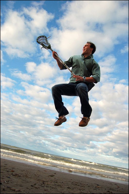
Renee Liddick Hall’s placement of the horizon line below this rocking lacrosse player gives him a feeling of power and fun in this wonderful photograph.


